In the third lesson on the psychology of interior planning, we apply the principles of scale, balance and proportion seen in nature to understand the basics of styling.
In our third (and final) lesson on interior planning, we will look at some basic rules for styling. By applying the principles of scale, balance, and proportion seen in nature, I give some tips on how to create beautiful displays on shelves, sideboards, (coffee) tables, and primary architectural focal points such as fireplaces.
Side-note: When it comes to styling, I’ve always used my gut feeling to determine whether I liked something and I’ve often been limited to the objects that were actually available to me. For the most part, I don’t believe in purchasing things just for the sake of creating beautiful styling. Instead, I always recommend only buying things that you truly love and being ok with leaving things perhaps somewhat bare as it gives the space the opportunity to evolve naturally. Even without closely adhering to the following design principles, I’ve managed to create some beautiful displays. Nonetheless, I believe they can be helpful guidelines, especially for someone struggling to “feel” their way through the styling process. Once you know the rules, you will find it easier to break them.
Angela Chrusciaki Blehm's home via Domino MagDesigned by Tali Roth via My Domain
Psychology Insight
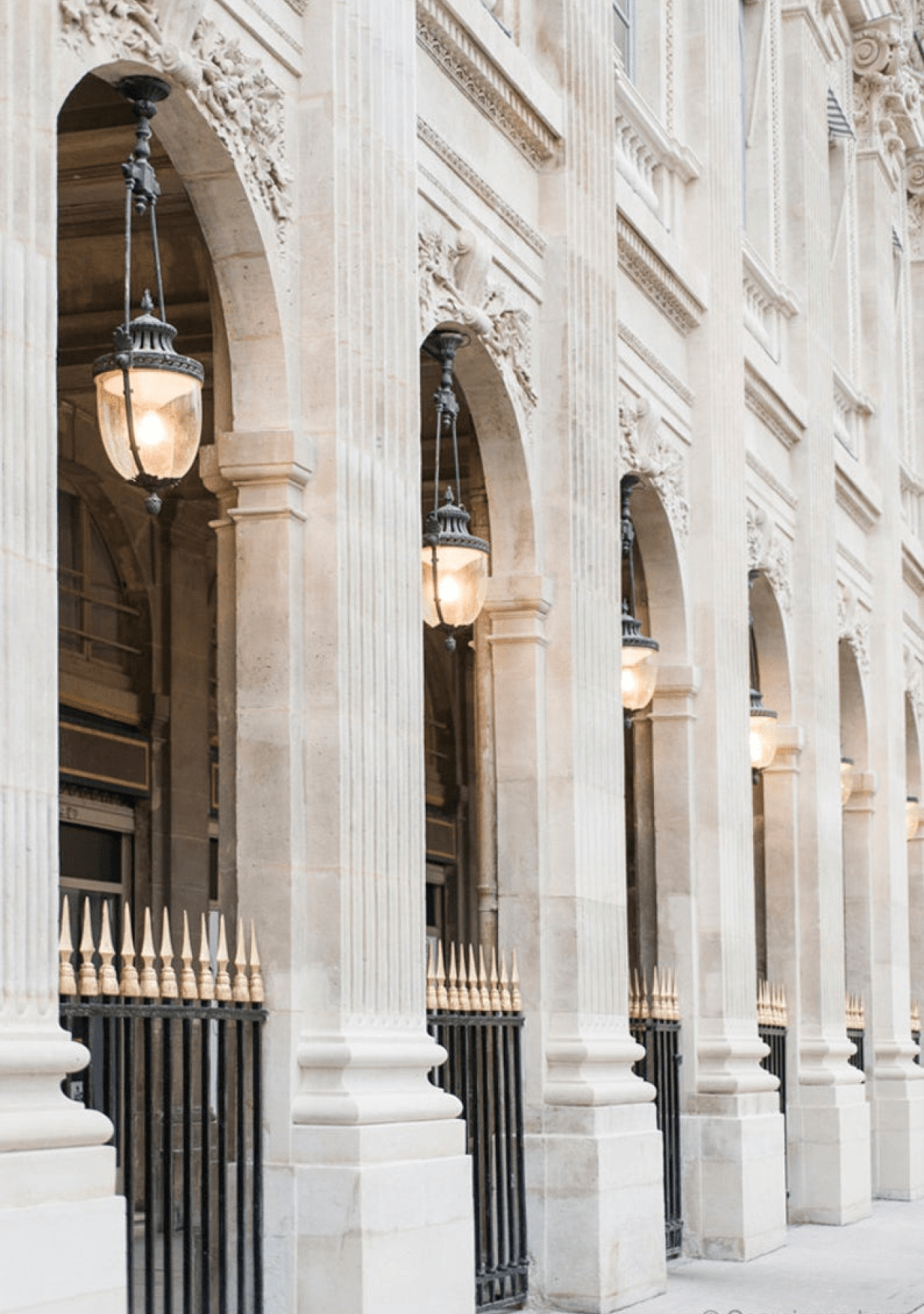
As humans, we are programmed to empathise with shapes around us. For example, our mind will sometimes interpret architectural columns as people holding up the ceiling or roof. This tendency helps us understand the principle of scale. The same rules as are found in nature apply: the thickness of a column, for instance, should be in proportion to what is being held up.
James Simon Galerie designed by David Chipperfield via MinimalissimoPalais Royal Paris
Lesson 1
Display
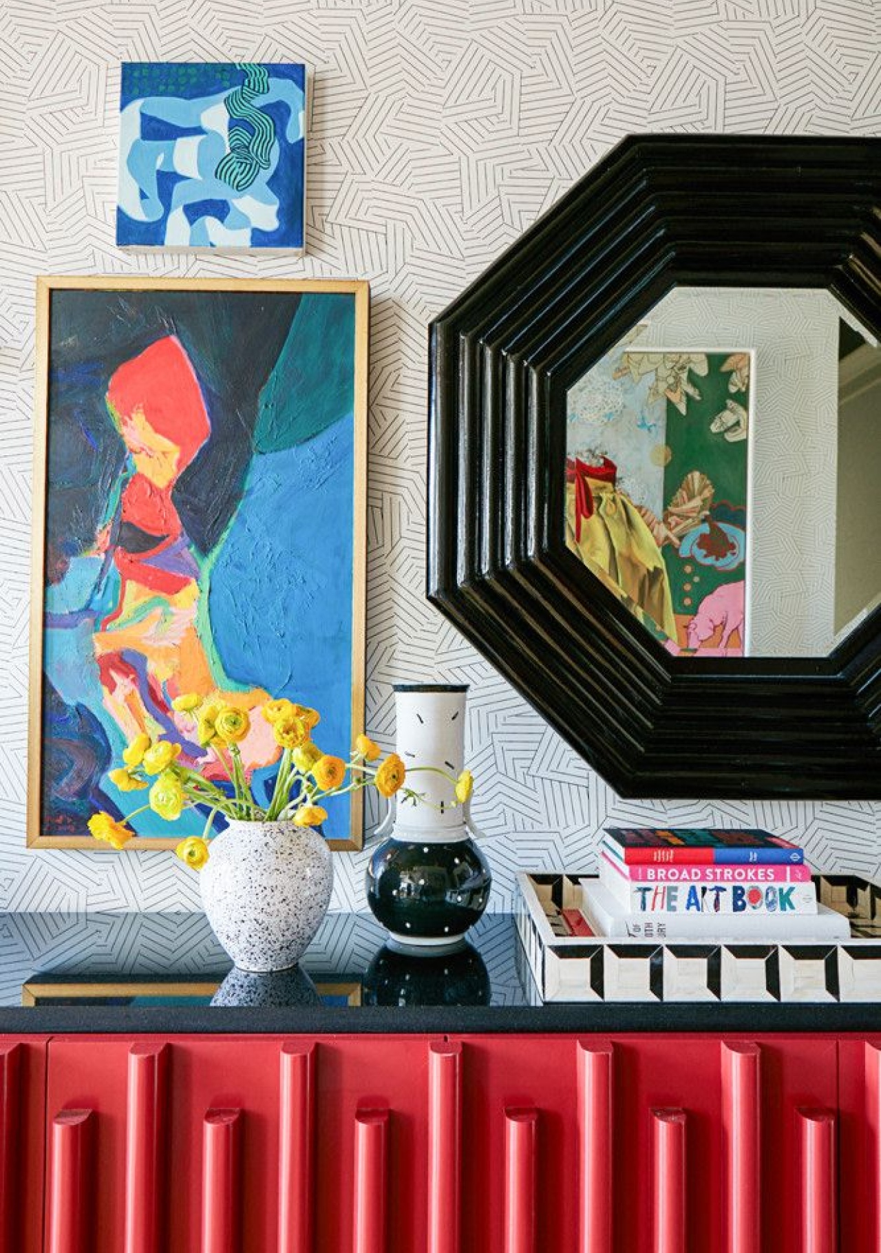
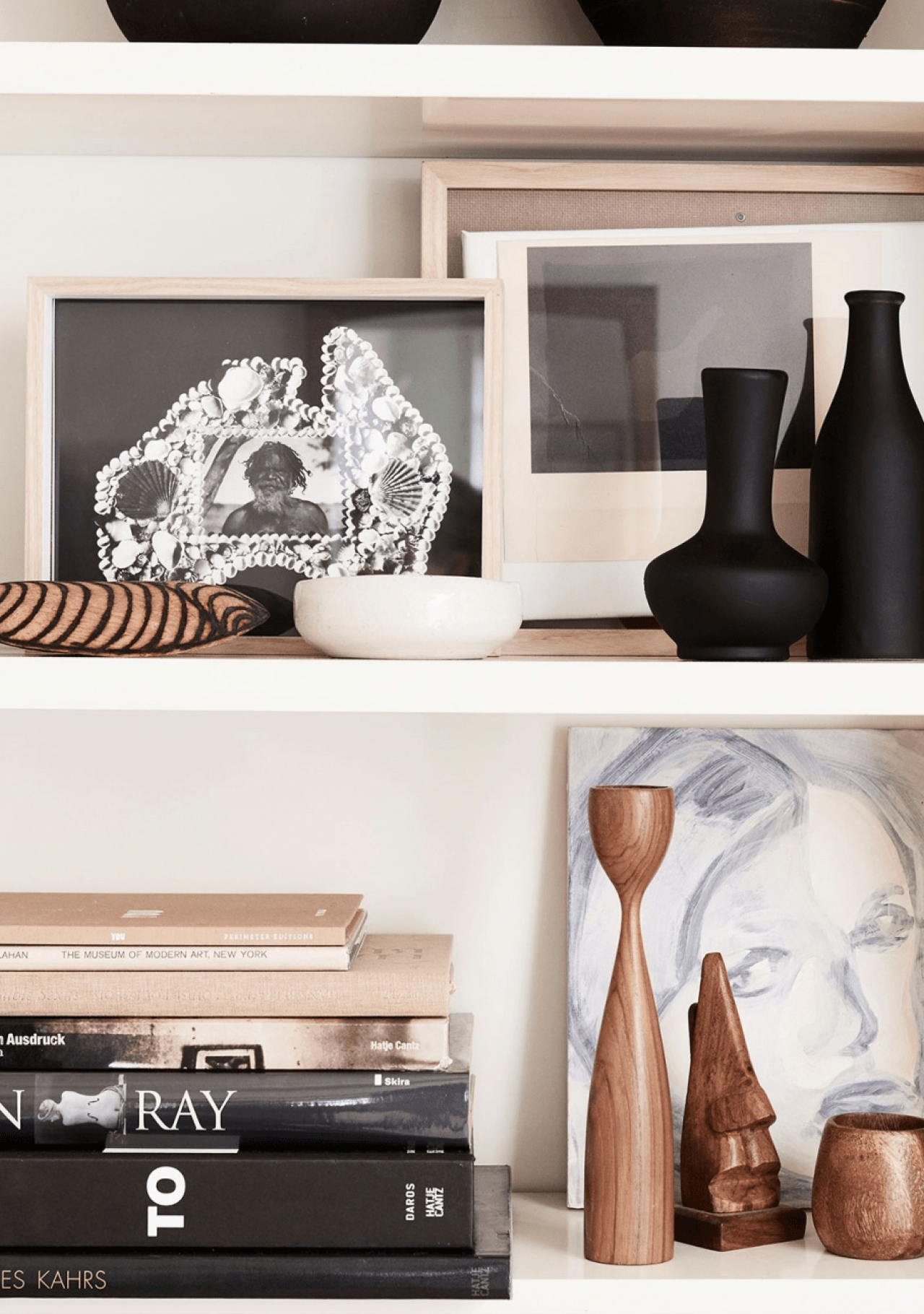
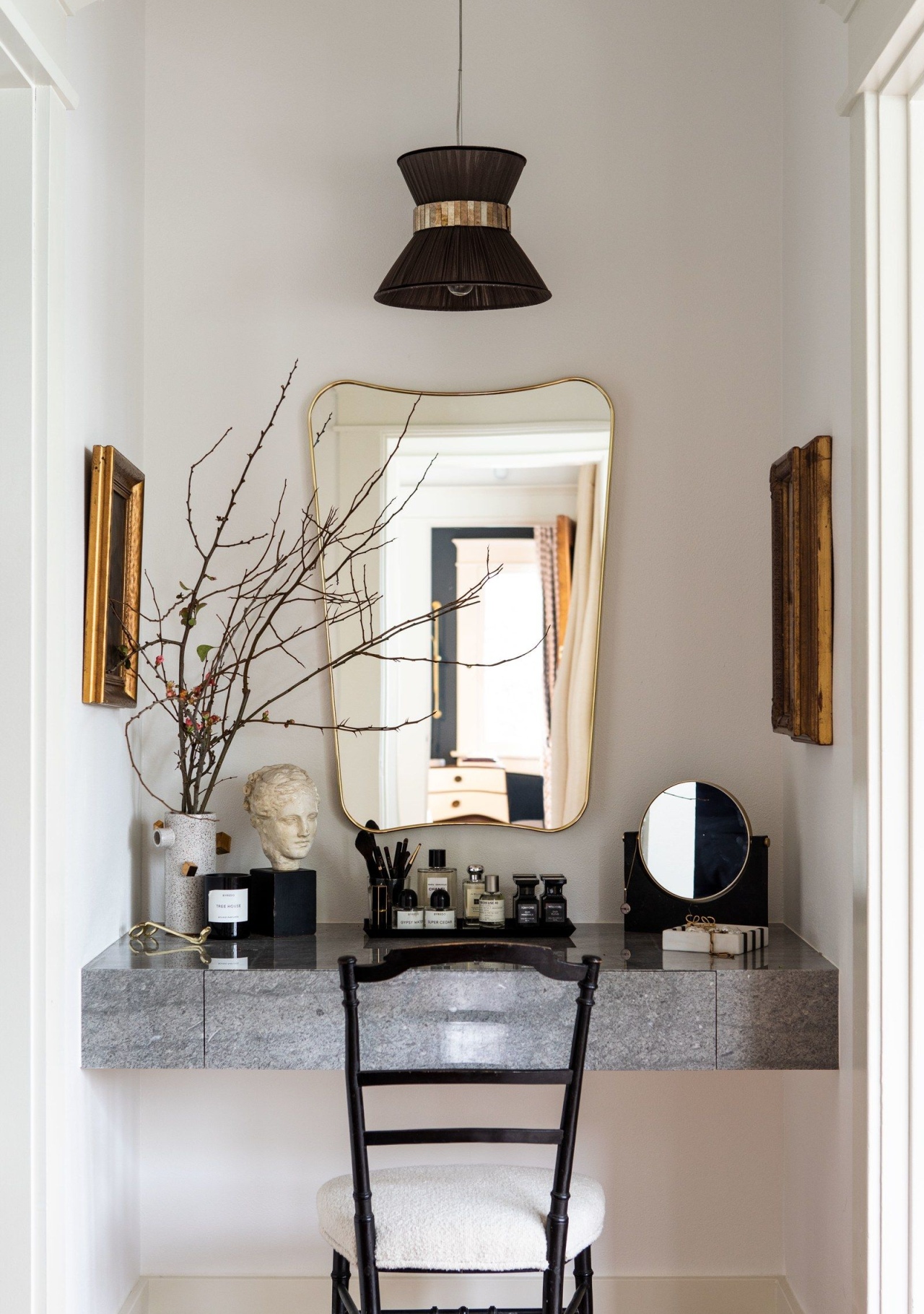
To create a beautiful display, start by decluttering. If you have too many things on display, they will be fighting for your attention. Perhaps it might help you to think of it as a hierarchy. Ask yourself which one of the objects are the key pieces and then add a few select objects that will help these objects shine.
Consider The Eye-line
Things that are displayed in the immediate range of our eyes will grab our attention first. You may want to consider what this would be from the different possible positions a person could take within the room.
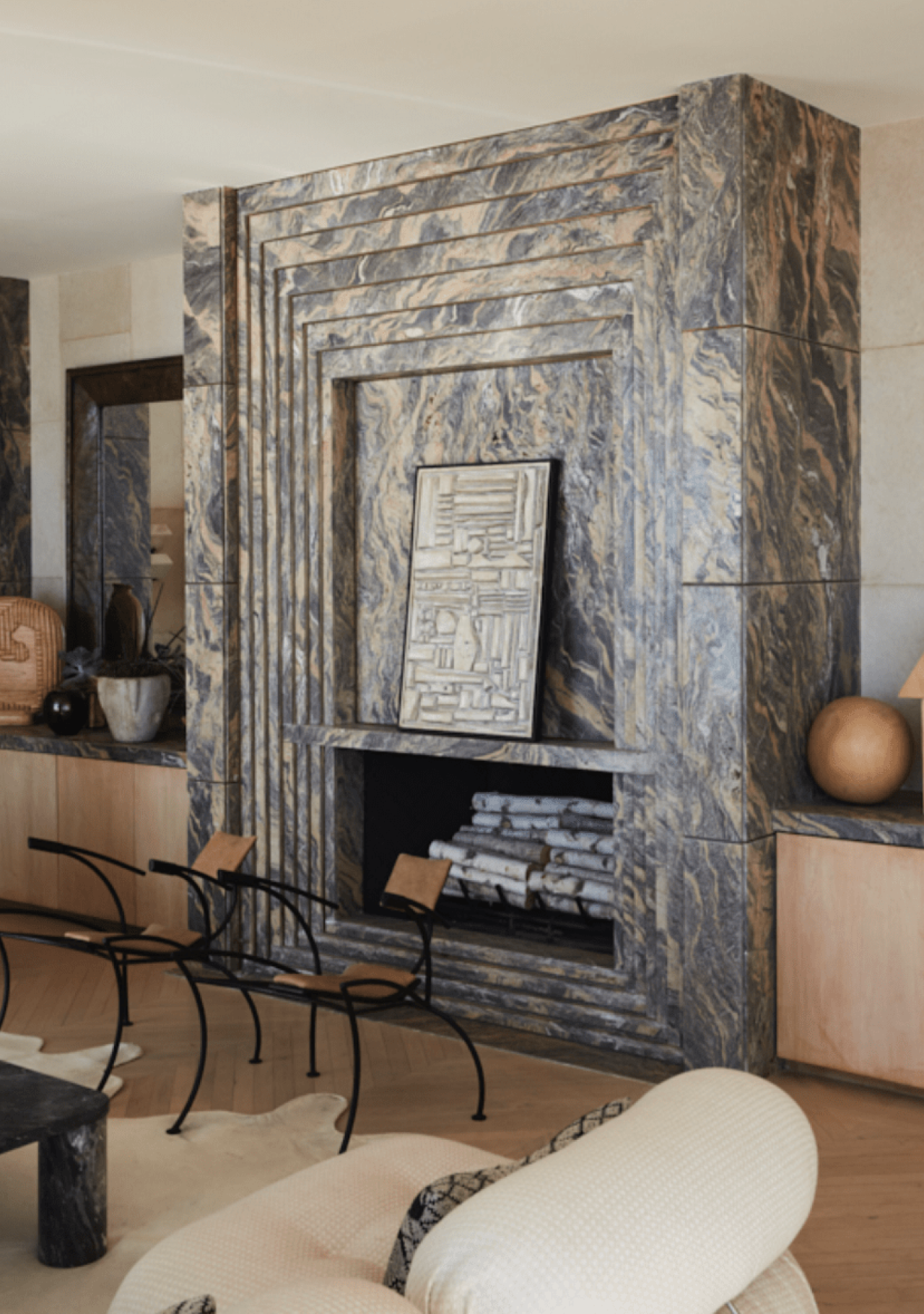
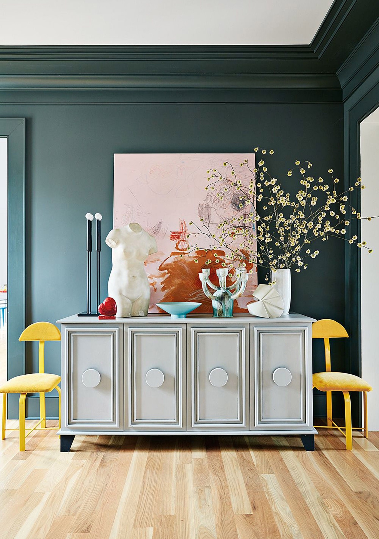
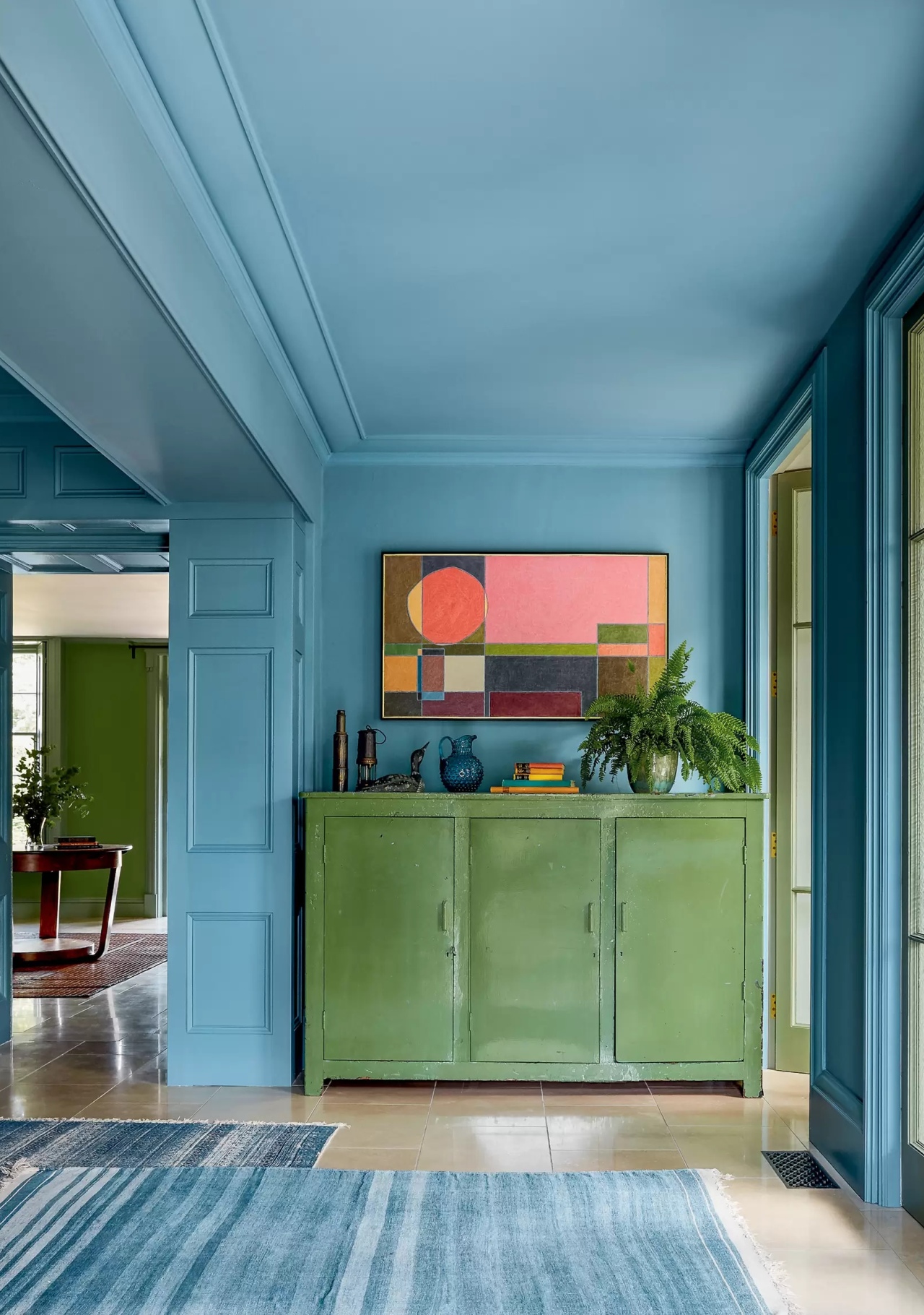
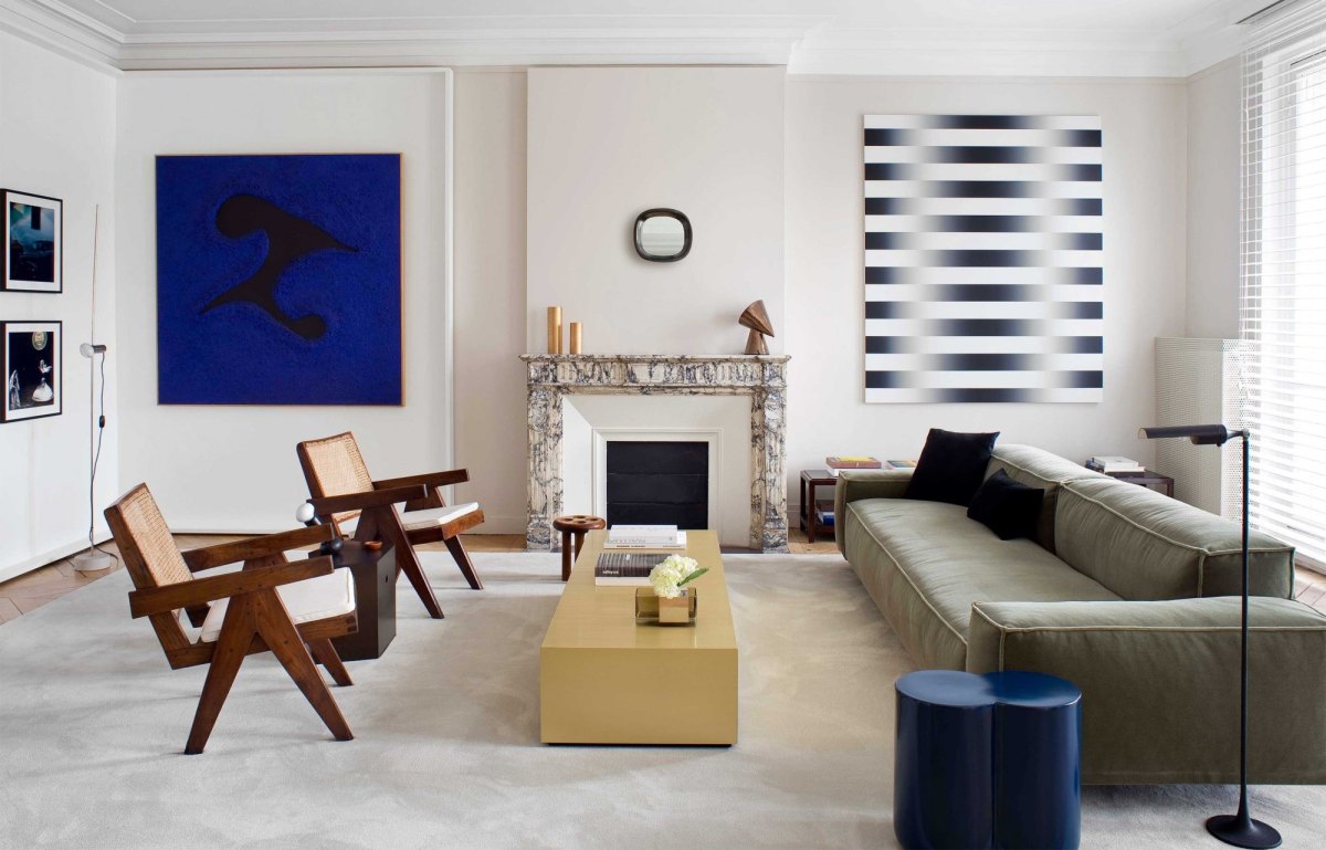
Example: The arrangement above focal points such as the fireplace, is designed to catch your eye when you walk in. Ideally, it should also work from the seated eye-line when sitting on the sofa.
Kelly Wearstler's Malibu ResidenceStyled by Laura Fulmine, Photographed by Ben Anders via Elle Decoration UK
If not, coffee tables are a great platform to engage the eye of the person sitting down.
Alex Eagle's London FlatThe Sculpture Residence By Nom Architects, Dux & Menu
Lesson 2
Rules of Nature
The same rules that work in nature can be applied to the art of styling. The key here is to establish a relationship between the objects you are displaying.
Scale
Objects are framed by their surroundings, therefore, scale refers to the size of an object relative to its surroundings.
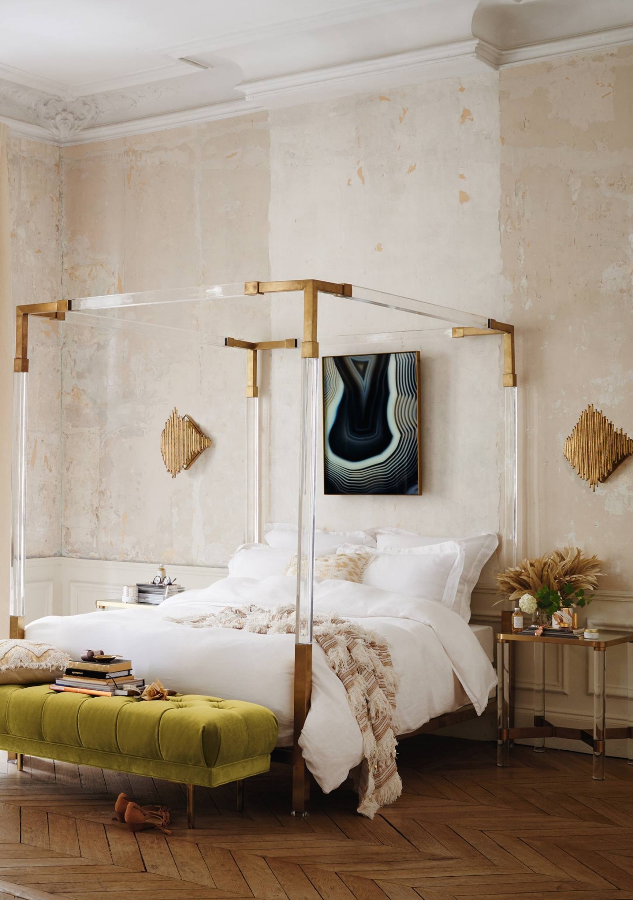
Big objects look better in big rooms
Four poster bed by AnthropologyVia Apartment 34
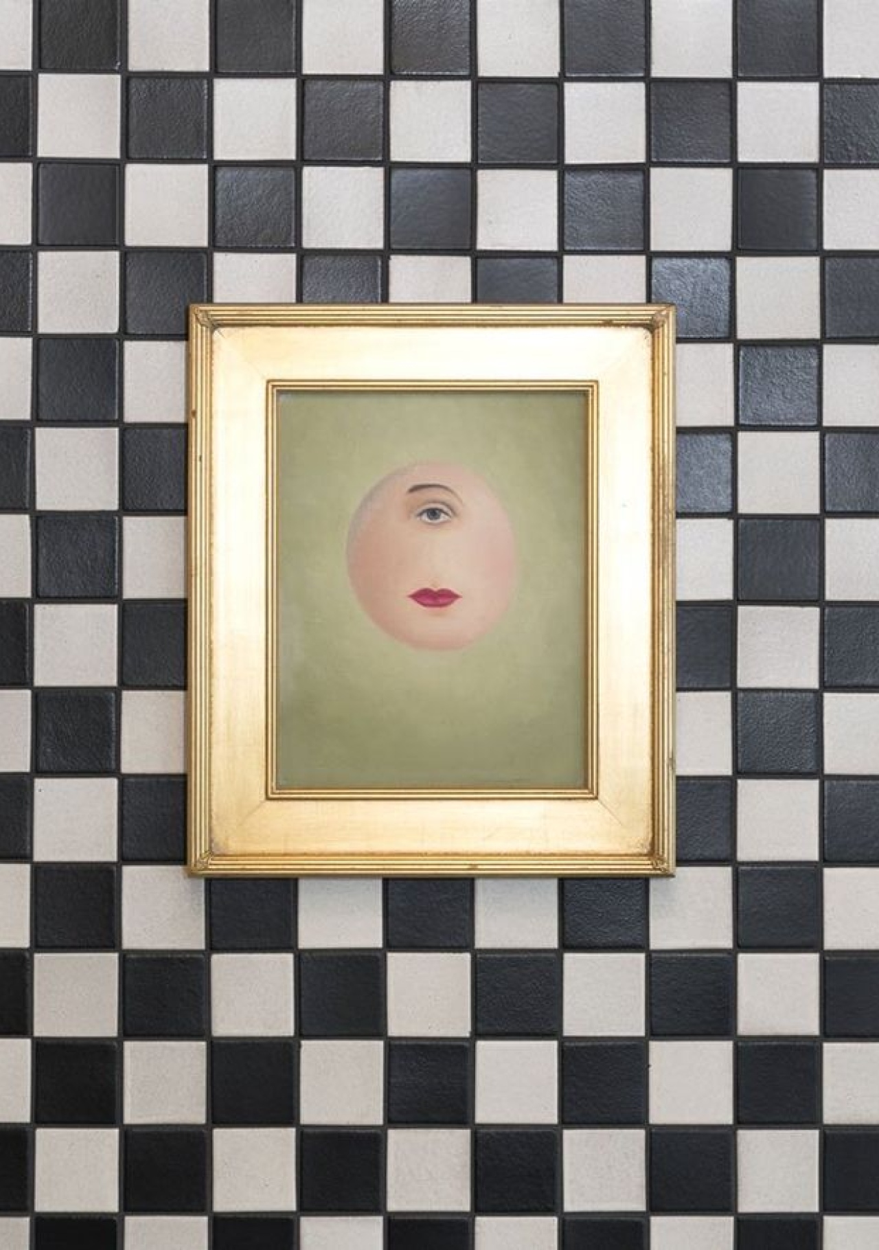
Know how to break the rules: Kelly Wearstler's small painting in the rooftop bar of San Francisco's Proper Hotel is impactful because it is set against small tiles.
Charmaine's Rooftop Bar & Lounge designed by Kelly Wearstler
Proportion
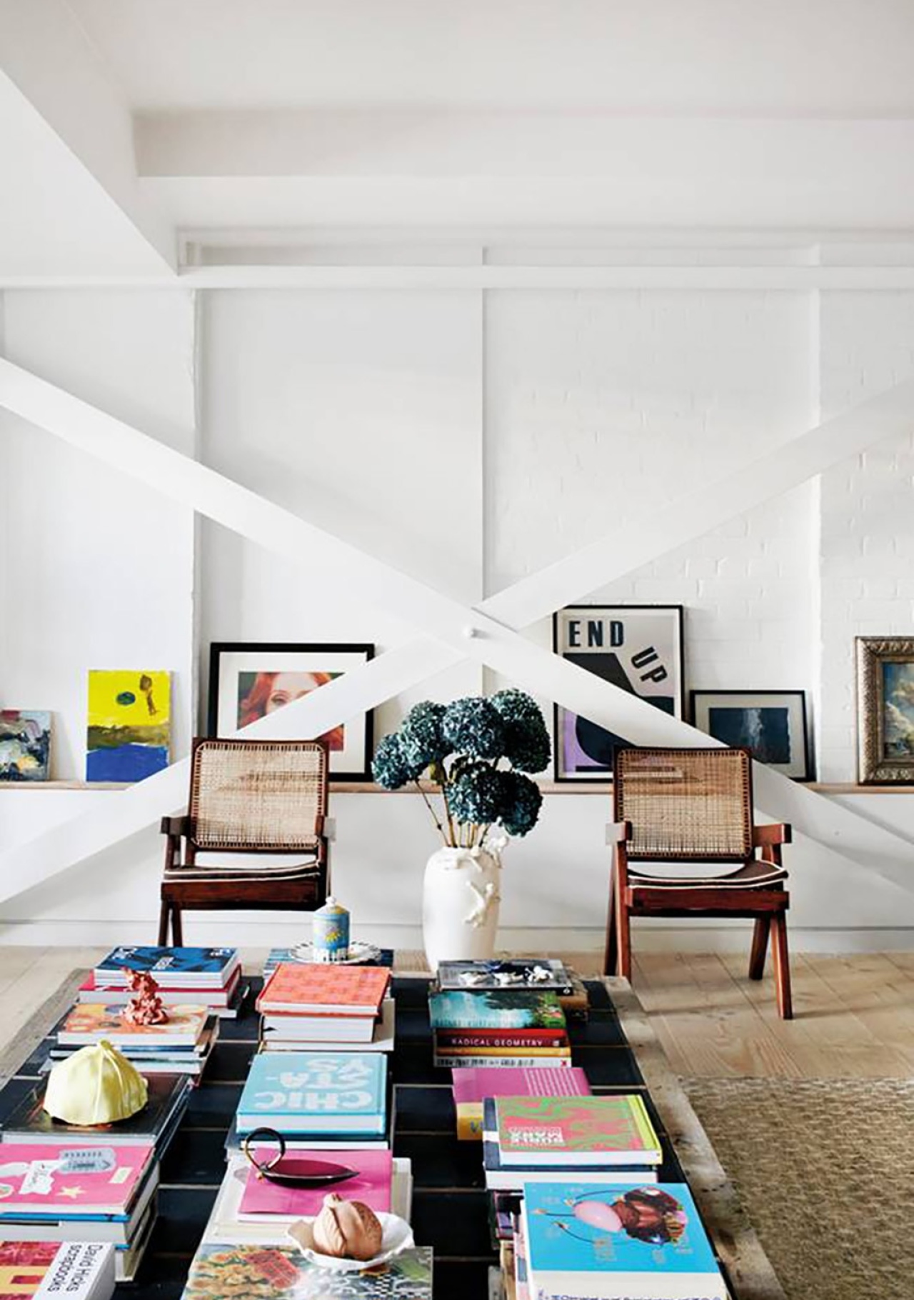
Objects that are placed with one another are often compared to one another and seen as a whole. Proportion refers to the ideal relationship between two or more objects.
Large paintings over small side tables look silly. In the example image below, the painting is larger than the sofa but because the sofa is optically connected to the small side tables on either side of the sofa, the whole appearance is in proportion.
Designed by Alyssa Kapito Interiors
A common example of ‘out of proportion’ that I often see in people’s homes is the size of their artwork or mirror above the fireplace or large furniture piece, which tends to be way too small. This could be fixed by having multiple smaller pieces that create one big whole instead.
Via My Scandinavian Home
H&M Home Spring 2019
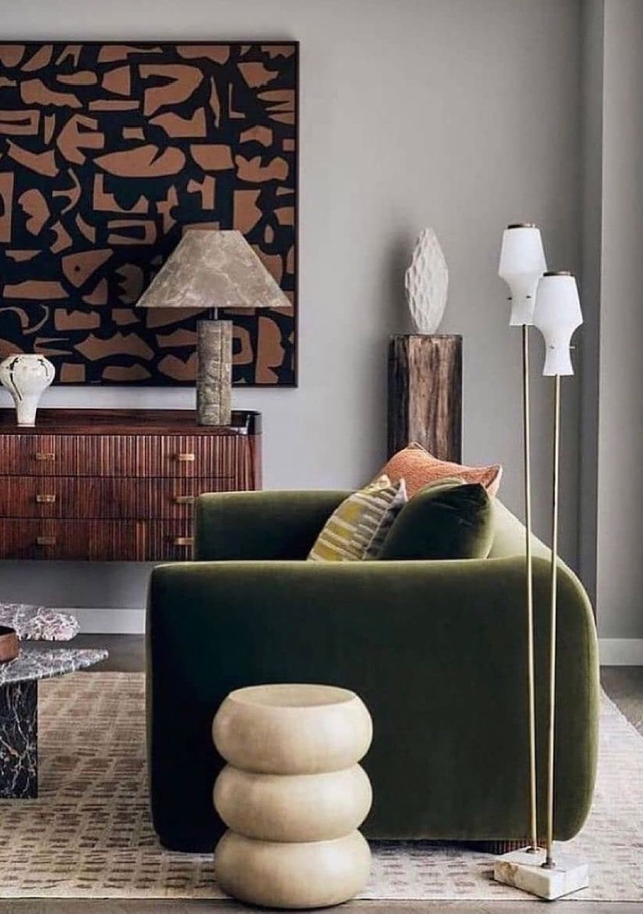
Groups Of Threes
When displaying objects, try to group them in odd numbers, ideally in threes. This looks best to our eyes because it is more representative of nature.
Photography be Debi TreloarArtist Caroline Wells & Emma Hill's home
If you are looking to display lots of small objects with sentimental value, form a collection around them and try to display them in a confined space, such as on a tray, a plexiglass box, a ceramic plate, or under a glass cloche. Make sure to form a collection based on a relationship between the objects. However, this doesn’t have to mean that a collection has to consist of objects that are the same, but they should look good together.
Designed by Martha Mulholland via AD
Below are some out-of-the-ordinary examples of how to make your special collections truly shine.
Designed by Faye Toogood
Display at General Store via SF Girl By Bay
Balance
Balance refers to an even distribution of weight between the objects on display. You can imagine the surface that you are displaying your objects on as a seesaw by establishing a centre point and making sure that the objects grouped on either side of the centre point have equal weight.
This could mean that you are displaying two of the same objects, two different but equally large objects, or even grouping smaller objects on one side and balancing it with one large object on the other side. When clustering several objects as a group, aim to do so in odd numbers.
Artist Angela Chrusciaki Blehm's home
Designed by Nicola Harding via House & Garden UK
Need some help putting these styling guidelines into practice? Get in touch or book one of my Design Services!
Need help applying these psychology-based principles to your space?